
Lately I’ve been thinking about what being online looks like. The actual look of it. The aesthetic.
As I continue to think and write and talk about escaping walled gardens, I’ve begun to notice more and more the bricks in those walls. Or the kind of concrete, the colours of the barbed wire, whatever metaphor works in your head.
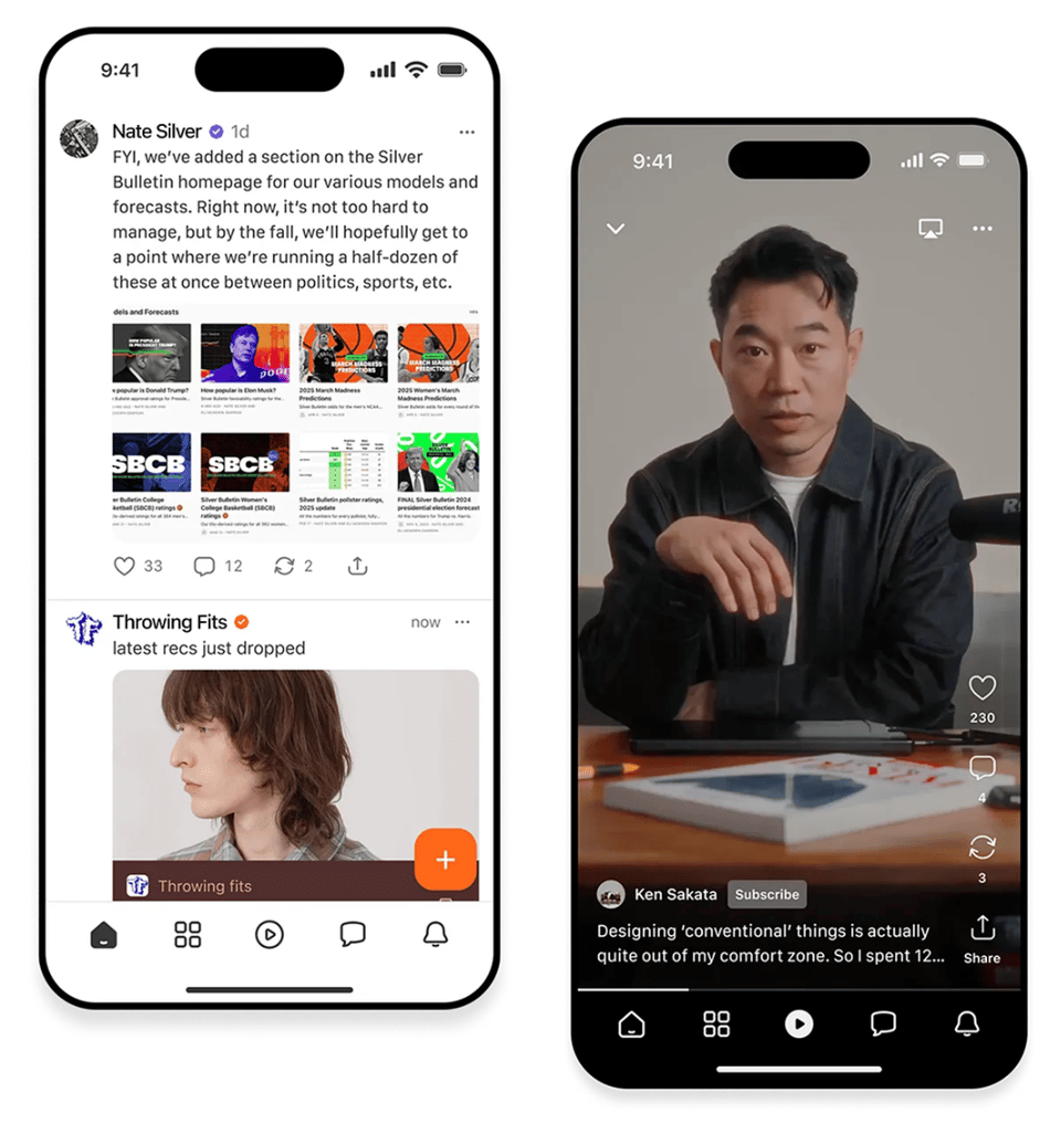
Take a look at this photo quickly and tell me what app this:

Maybe the border colours in the screenshot tipped you off — but this is how Instagram shows you its app on its own website. Look like the fave photo sharing site you remember?
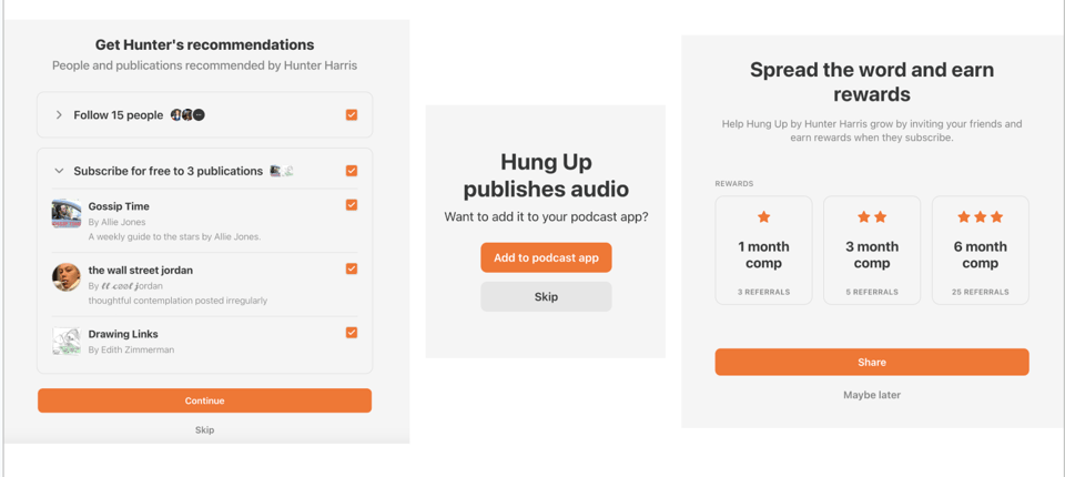
Let’s go again. Which app is this:

This is Spotify. Try finding the music you love amidst its current front page onslaught of video, podcasts, video podcasts, and audiobooks — I dare you. Then talk to a parent of young kids who has carefully controlled their access to Youtube, only to find that the innocent “music app” is now feeding them the exact same dross.
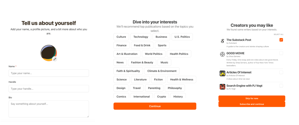
One more:
This is the one that set me off, actually. This is Substack’s app, jam-packed with every dark pattern I’ve come to hate about the current era. If you haven’t done this lately, let me show you what trying to sign up to receive a free email newsletter is like now:

Ugh, I just needed to get that off my chest, sorry. Back to the look of it all, though.
The independent web never had a single coherent aesthetic, obviously, because everyone made it look like whatever they wanted it to. It was constrained only by what the html/css could do. And so it was individual, chaotic, often weird and it was always personal. It was the sewing and embroidery site that didn’t close it’s <h3> tags, and the Time Cube guy. If you’re too young to have experienced this first hand, hit “surprise me” on this page and get shown web1.0 sites that are still around (Wiby is a search engine of the early web, which as I send this is currently down — appropriate).

Now we think about this era as a pixelly time of flashing “under construction” gifs and hit counters and tiled backgrounds. But the core components were more “here is what I care about” and “here are some other things you might be interested in”.
The early platforms started to consolidate us together, but they were still deeply personalisable. MySpace and Geocities pages were as eclectic as the self-built ones. Early tumblr was all about your template, and let you muck around in the css yourself to make it look exactly the way you wanted. Early sub-reddits were styled to the hilt, and browser extensions like RES let you further make your experience exactly your own.
Then sometime around the mid 2010s it started to change, and platforms started to coalesce around clean, uniform interfaces. We saw more template-driven content structures (profile grids, feeds, carousels). Everything had to conform to brand guidelines and UI patterns, and as a consequence it was suddenly homogenised — even wildly different creators’ pages looked the same. You can point to various reasons for this — Google acquired Blogspot, Yahoo! acquired tumblr, Pinterest moved into its shopping-first era, everything became an app.
To begin with these platforms forced us all into their stylised boxes and now, as you can see up top, they’ve made all the boxes look and feel the same.
So if web aesthetic = the messy, expressive look of the open internet, and platform aesthetic = the polished, standardised design of closed ecosystems, both aesthetics say a lot about power, creativity, and who controls the experience. That’s probably uncontroversial. What I want to think about now, though, is what the new web aesthetic is.
As we start to focus on building the good internet, it’s cute and fun to nod to the retro stylings of the web1.0 era — reinventing webrings and blogrolls and giving everything an anti-squarespace feel. But whatever is next shouldn’t be retro. It should be its own thing.
Over the last months we’ve talked about exploration, and gardens, and archiving — how to bring discovery back when search has been killed by AI slop and google tells you to eat rocks. I’m not a designer, so I’m not about to tell you anything about layouts or typefaces or colour palettes. But here’s what I think can be the core of the next era of the web.
I think the new web aesthetic is about getting active again. Platforms encourage passivity. They want us to stay still and scrolling, looking at what the algo wants to show us. Like, swipe, repeat. But the new web aesthetic is non-linear. It encourages you to move from one site to another, to dive down rabbit holes, and crucially, to continue sharing what you find.

Sites that reflect a person’s process, not just their conclusions. It’s working with the garage door up.
Recently I was ranting to a friend about [redacted], a thinkfluencer who annoys me, because he tends to gather together the ideas of others and publish what he sees as the definitive essay on a topic without crediting any of the other thinking that’s fed into it.
By contrast, the new web aesthetic is link-heavy. It constantly references out to other spaces, to past work and to related ideas. It sees the web as an ongoing conversation, not a feed. You’re encouraged to leave the page.
Platform aesthetic is ephemeral. We all know the experience of going to show someone a post, only to find the feed has refreshed and the meme has vanished, and you’re never going to find it again. Older content disappears from view by design. The new web aesthetic is persistent and browsable archives (that don’t rot!). Content is meant to be discovered over time, not posted once and done.

The new web aesthetic returns agency to the explorer. You decide what’s interesting. You wander, and as a consequence you stay with things longer.
Anne-Helen Peterson wrote this week about the demise of Pocket (ironically on substack):
‘Welp, I read the internet,’ he’d sometimes tell me around 10 am. “Got anything else for me?”
I always did, because I also read the internet in that way. I used a combination of Google Reader, favorite websites I’d refresh multiple times daily (The Hairpin, The Toast, Grantland, Jezebel, Go Fug Yourself), and followed links from those sites to other stuff the editors thought worth my time…
I’ve come to think of these years as the halcyon days of the post-recession internet, a sort of second golden digital age. It was before so many publications’ fate became inextricable from social media, so even though everyone over at Gawker Media was still being badgered by the traffic leaderboard in their offices, the idea of the homepage still held power. People navigated to your site because they liked your site and knew they found good stuff on your site; then they read stuff there. Not just scrolled, but read.
The new web aesthetic wants to make us readers again. And not whatever this is.
My own site design doesn’t embody all of this yet, but it does reflect the colourful, chaotic, joy-filled nature of the fandom spaces I love. You can find everything I’ve written or talked about there. You can find my weird little side projects. And through this newsletter you can follow my thought processes and dive down the rabbitholes with me. The next iteration, for me, is surfacing more of this. Making it more discoverable. The map may not be the territory, but it’s a good place to start.
more good stuff
this is about the horrors, which I tend to avoid, but Jason Kottke has pulled together a bunch of life-affirming posts in one place: How to weather the storm.
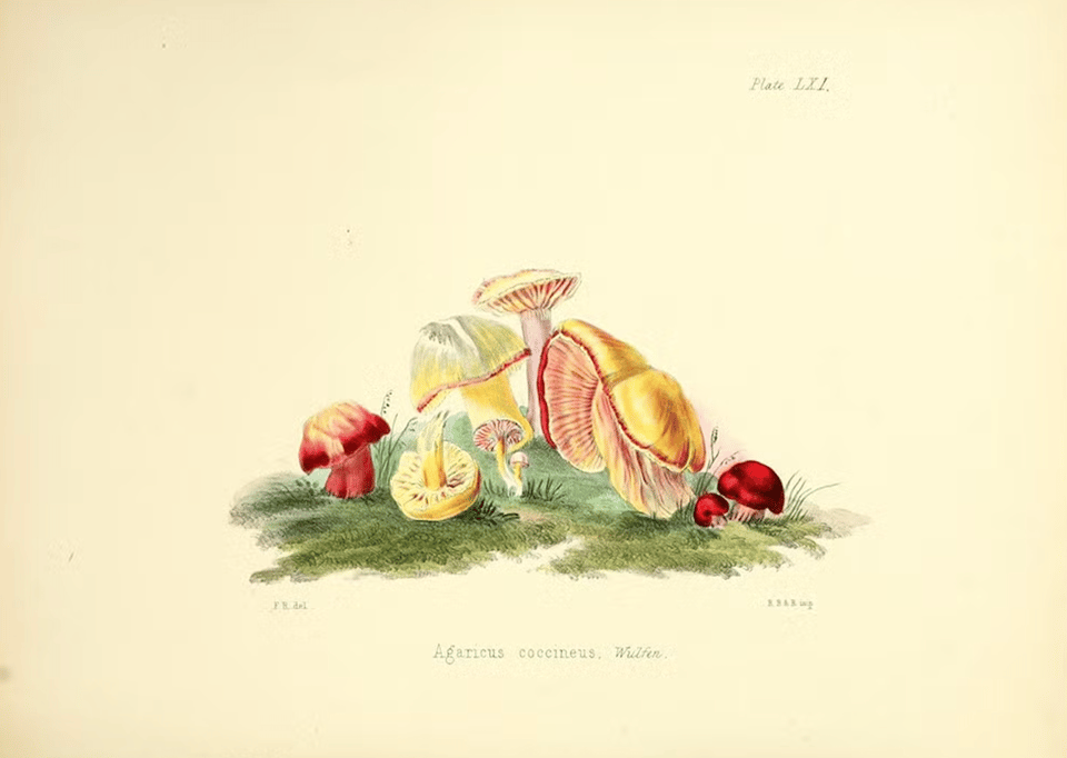
The Fungi-Mad Ladies of Long Ago. This one is for Alex, my fave fungi-mad lady. In mycology’s early days, botanical drawings by women were key to establishing this new field. “Studying fungi was decidedly unladylike, and the scientific establishment largely ignored these women despite their valuable professional contributions.” What else is new.
new research on how we remember stories, which is completely fascinating.
People remember all kinds of things: phone numbers, grocery lists, historical dates. There are models in neuroscience that can explain this sort of “random recall.” But story memory is different. “When you recall a narrative, you never recall it verbatim,” ... Instead, you remember what the story is about. “You can give a one-sentence summary of Romeo and Juliet, but that sentence most likely doesn’t appear anywhere in the story,” Tsodyks says. This type of abstraction has made story memory more difficult to characterize than random recall.
finally, in my lego city

Forward this email to someone who wants to go exploring.
You just read issue #26 of what you love matters. You can also browse the full archives of this newsletter.
-
This article totally resonates with me ! I'm building https://fika.bar precisely to improve the content creation/curation/consumption situation right now
Add a comment: